We have been asked to design a poster or a brochure that would be used to advertise our Degree Show. The poster itself needs to be quite simple and have enough information to tell people what and who we are, but also it can’t say too much so that people can go and explore the show for themselves.
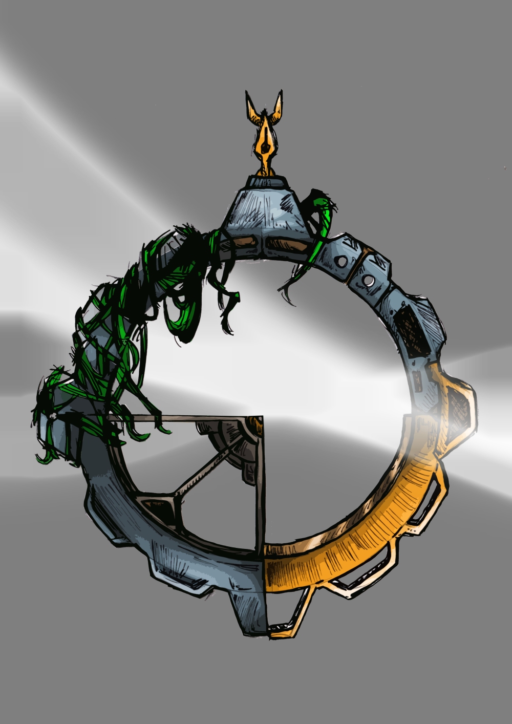
For the poster, my idea would be to split the logo into 6 sections (as there are 6 people in our class) and re-design the logo to fit our FMP idea. I would draw my side out in pen, and add some of my anatomy drawings, I would ask Ryan and Joe to create theirs in 3D end render a top down view of them, Ryan’s would be a high sci-fi model, Joe’s would have a stylised texture effect etc.
In the end, if all 6 posters would come together, they would make the logo in the middle but made of 6 different sections.
For the email I was thinking of creating something on a line of a games newsletter. I was thinking of getting assets from everyone, and creating an image that would represent the universe of timeline.
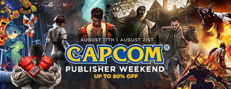
The term used for these is a Publisher Sale. This shows the brand name, and the games that the brand has created.
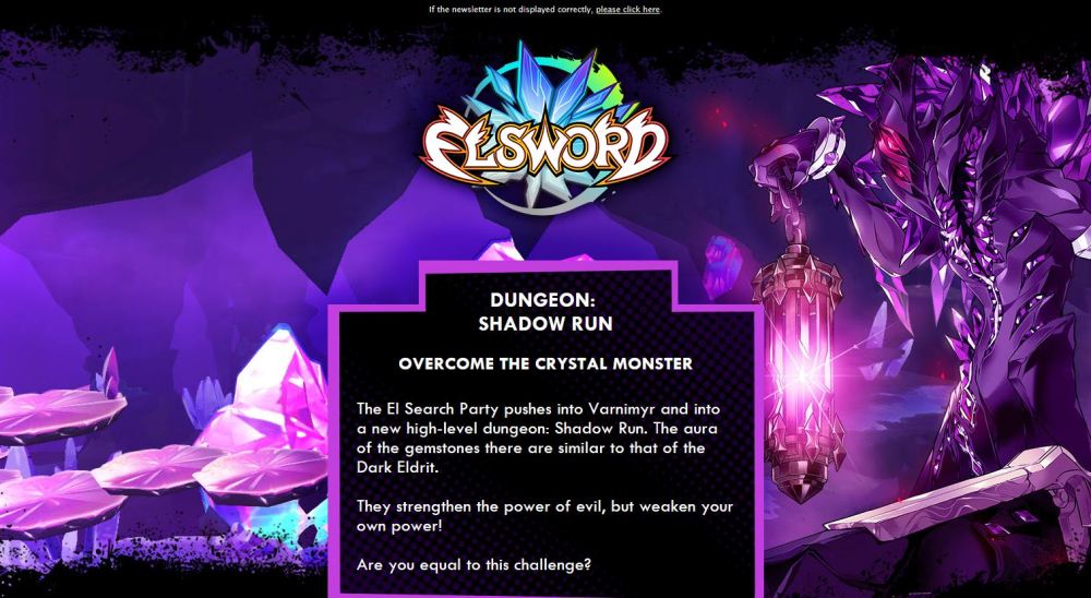
This is an example of an email that has been sent to me from a video game that I play. This is a really cool layout that in the background, showcases what is going on in the game, and then gives you a little information about it. Also it includes a button at the bottom that works as a hyper link that sends you to their website.
We could do something similar for the degree show, and link it to our own website.
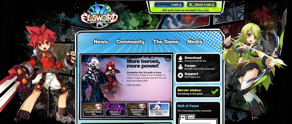
This is a screenshot from the Elsword website, I was looking at the banner and I did think that the comic book style looks quite cool when it comes to presenting work that may seem out of place if seen next to one another. Everyone in our class works in a different style, so maybe a subtle banner that would be displayed at the top of the email/poster would be quite interesting, probably more for the email.
I have found this tutorial that explains how to create a comic book effect with the black dots in the background in an easy and simple way. This is a technique that I do want to try for the email banner.
This is the first attempt at trying to create something on a line of an email that the people who we invite would receive, I am not 100% sure where I am going with this, although I do like the comic like banner at the top which I think would be used eventually.
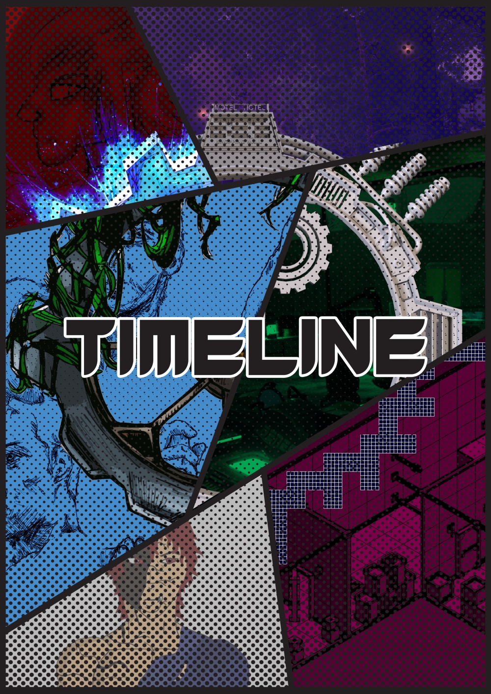
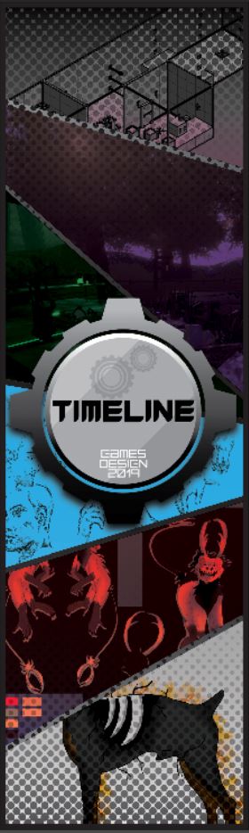
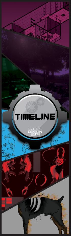
This was an idea for the poster that I do like due to it being a team effort from the group. The idea was to have my colleagues using any form they want to in order to re-create the logo, and add as much or as little to it as possible. I would then put it together into the panels shown above, to create one whole logo, using everyone’s design.
This was my re-creation of the logo we have used to represent our degree show. I have used the style that I draw in, and also the techniques I use to paint things in Photoshop and using the Cutout Effect for the stylised aesthetic.
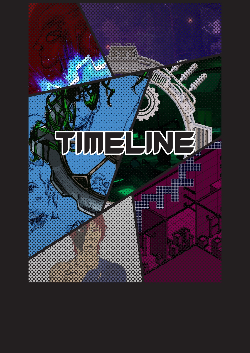
The main issue was the fact that I had no where to put the important information like the venue, room number, and the Hull logo as it is a requirement. So I was advised to in a way frame the main poster, and re-size it so that I can put the information below it. I could perhaps create 2 additional panels of just the dotted gradient going down both of the sides to not make it seem too empty.
The idea for the poster, immediately turned into an idea for a banner. We as a class have decided to use Scribes Digital Printing Ltd in order to print out the banners. I have downloaded the template that was provided on the website with dimensions of 60 cm x 200 cm. This is where the main issue appeared, I couldn’t exactly use the poster idea as a banner, due to the banner template being quite narrow.
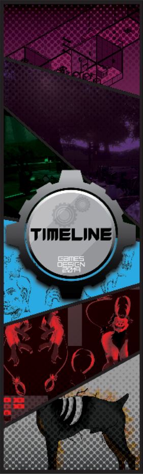
This is the first idea for the banner, I did want to include everyone’s re-creation of the logo on this specific banner, but due to the fact of how narrow it is, I unfortunately couldn’t do it, and I didn’t want to exclude someone’s work so instead I decided to use the official logo for the show. I once again went with the Halftone gradient, unfortunately I had few issues with that too. I wanted the dots to have the same colour as the border of the panels. But I couldn’t figure out how to make it look as effective as I did on the poster, due to working on a much bigger scale. I did in the end manage to create a gradient in Illustrator and turn that into a Halftone, but the white on the gradient made everything behind it look “Milky” which was very off putting in my opinion.
As you can see, when the Halftone goes above the panel lines, it does turn white almost. Another idea was to don’t use the Halftone effect at all.
I do personally prefer the first version with the Halftone effect and the Multiply blend mode, but I still need to figure out where to put text and the college logo. I could just create a separate panel at the bottom with the same colour as the border lines, and then add the information at the bottom.
I have made the decision of making the banner quite simple and have no information on it at all. We are going to have 2 banners, one in front of our studios and one in the reception. Since most of the degree shows are being held on the top floor of our building, I do believe that visitor’s will not have any trouble finding our room. But just in case, the room number is actually displayed on the poster.
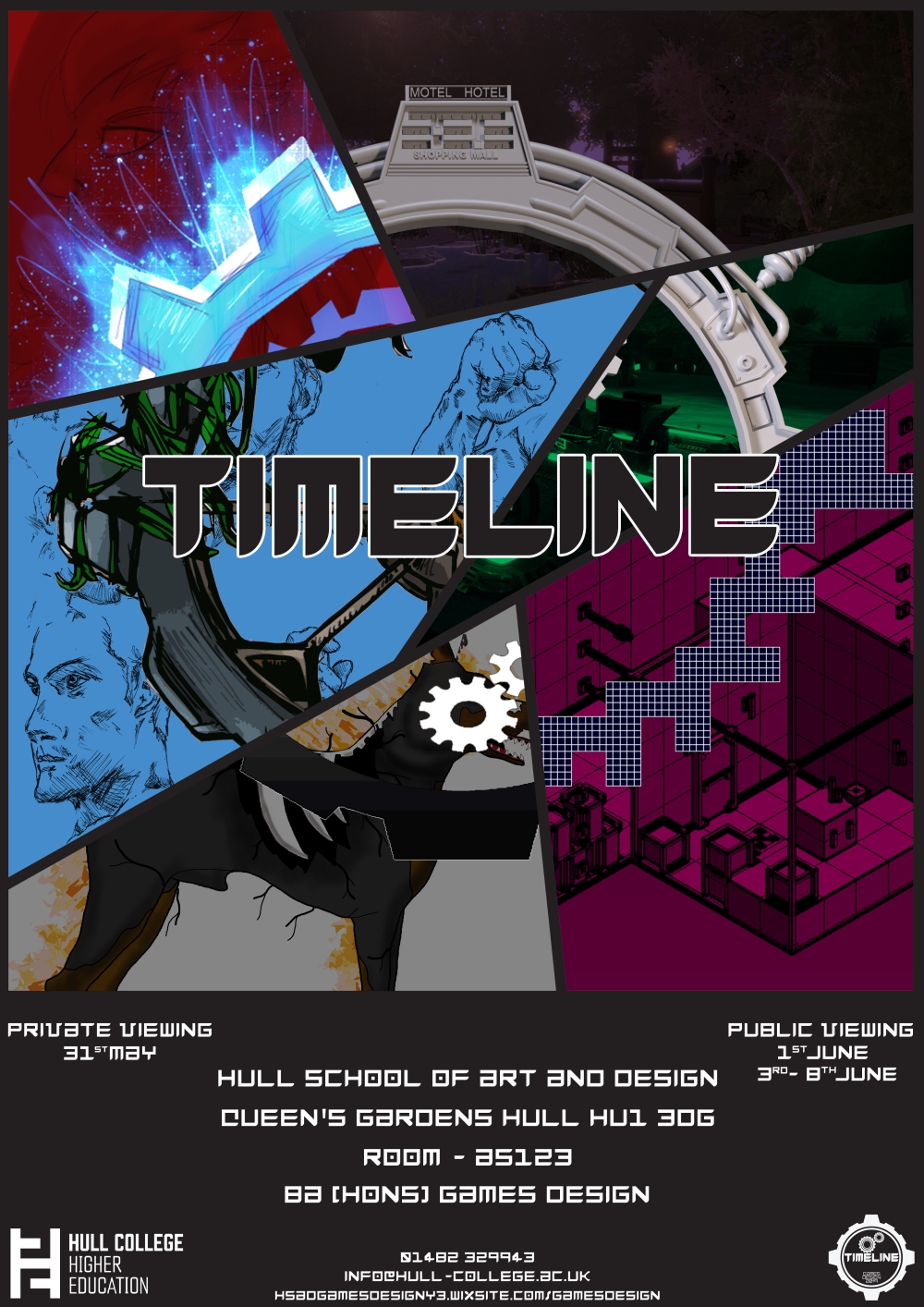
This is the final version of the poster I have created. I have used all of the logo re-works from my group I also decided to keep the design cohesive by not using Halftones. The font used for the information is actually the same font that I have used for the main logo. Unfortunately when I was creating the logo, I did make the font from scratch and only used the letters that I needed. I have then decided to go back onto Fontstruct (I have used this website for creating a font for the Client Project) and created the font from scratch using the tools available on the website.
